Creative Direction
It means for us becoming part of a story, taking into consideration the company's past, its cultural background, its traditions and establishing an empathic relationship with it, the basis for the success of any project. A creative approach and research at the service of a design capable of telling the uniqueness of the company and its products.

Trends Post-Covid SS21/22
The Covid-19 pandemic has changed our world, leading us to huge challenges for the future. Cause of the big societal and economic consequences consumption and communication behaviour has chaged radically and with it the way we interact each other and with the surrounding environment. In this Trendbook we try to make some predictions as to how Covid 19 will influence interior design and which will be the trend themes for 21/22 season.
→ LEARN MORE by going to the Shop Page

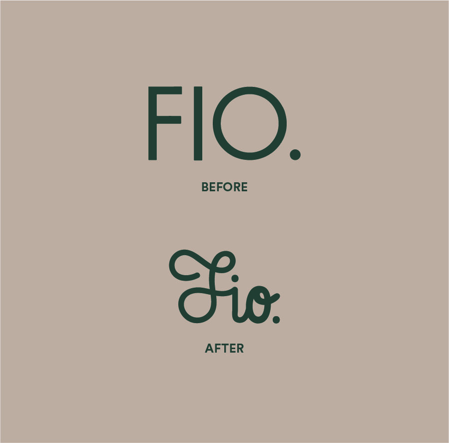
Fio., Rebranding Graphics Design and Creative Direction
It was an honour for us being called to realize the re-branding of Fio., the sub-brand of Fioranese Ceramica. The new logo is based on the use of a brush to write Fio., an abbreviation of Fioranese Ceramica.The use of the hand brush is intended to emphasize the craftsmanship of the line of products and the sophisticated graphic and material refinement. A new logo that focuses on a fresher and calligraphic lettering to radically change the brand image into a "loved brand".

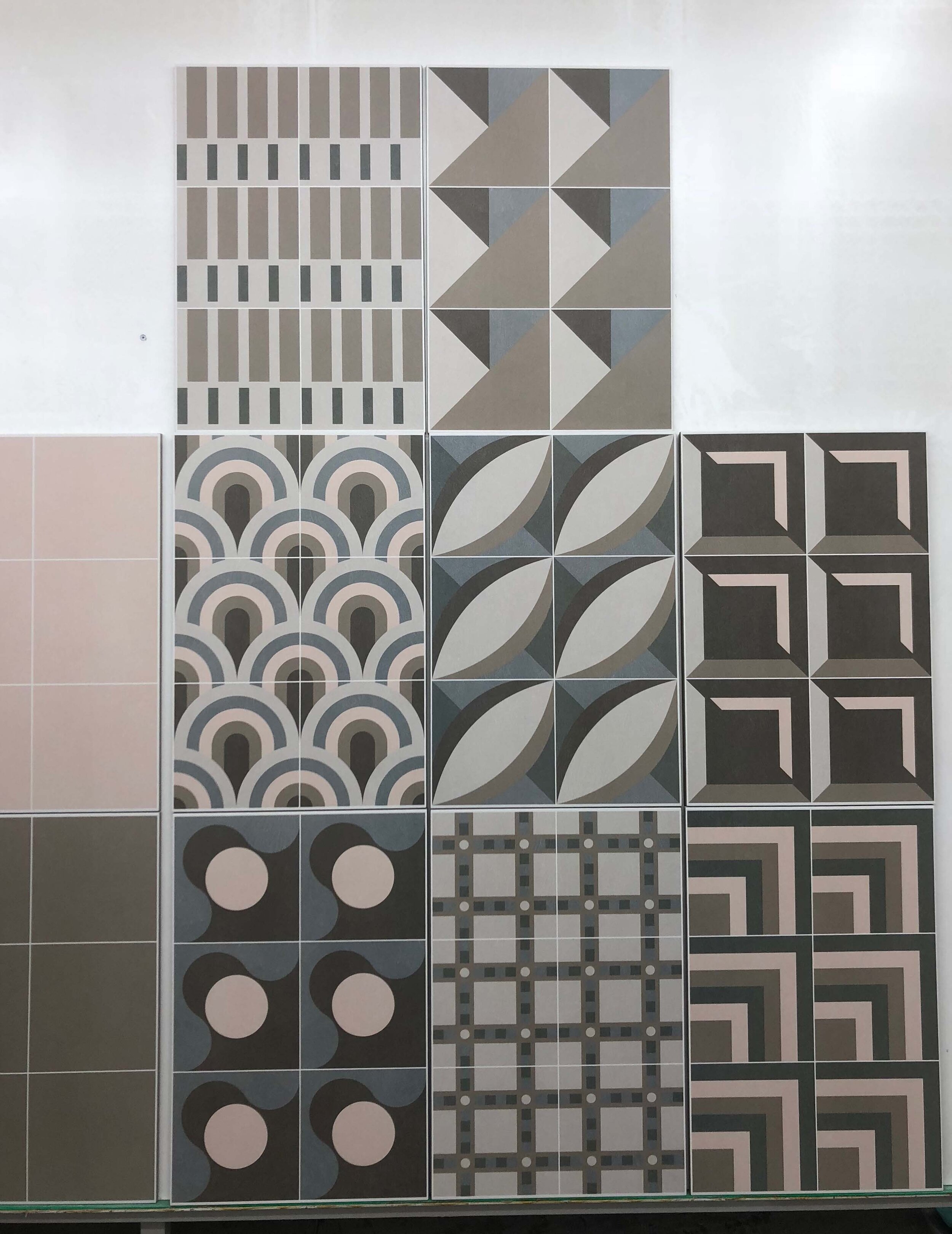
Fio., Liquida Collection - Product, Graphics Design and Creative Direction
Liquida, the new collection in 20×20 curated by Davide Tonelli for Fio. is the beginning of a new path of investigation in ceramics whose goal is to look to the future by returning to its customers and collaborators collections that maintain and reinforce those that have always been the distinctive traits of the brand: recognizability, research of new surfaces, union between matter and technology. That is Liquida. A collection that wants to emphasize the company’s historical know-how in its transition from the analogical to the digi-tal era. Six pastel colors, the result of an accurate analysis on the new color trends: ivory, taupe, pink, sage, sugar paper and cacao to create an eclectic collection completed by eight patterns expressing different languages of the contemporary able to dialogue with residential and not, in which sociality, “co-living” are new needs to be satisfied.
Ph. Courtesy of Fioranese Ceramica, First Lab Tests
Fio. , Brand identity and Creative Direction
We are proud to have played a strategic role in relaunching Fio. - the sub-brand of Fioranese Ceramica - with a radical change not only in terms of image but also of thinking by working closely with internal Mktg Dpt. We all define around a table what Fio. was now and how how we wanted it to become in the future. We built the new image and the whole manifesto of guidelines on which its new narrative rests. The graphics of this step are contained in its new logo, consisting of the name of the brand “handpainted” to symbolize a line of products that combines designs and trends, craftsmanship and technology. Eclectic, handcraft, avant-garde, loved: this is the new Fio., and its values are reflected in its language of signs, words and colors.

First Tests in Fio. Lab (Ph. Courtesy of Fioranese).
Fio., Liquida Collection - Product, Graphics Design and Creative Direction
Liquida, the new collection in 20x20 curated by Davide Tonelli for Fio. is the beginning of a new path of investigation in ceramics whose goal is to look to the future by returning to its customers and collaborators collections that maintain and reinforce those that have always been the distinctive traits of the brand: recognizability, research of new surfaces, union between matter and technology. That is Liquida. A collection that wants to emphasize the company's historical know-how in its transition from the analogical to the digital era. Six pastel colors, the result of an accurate analysis on the new color trends: ivory, taupe, pink, sage, sugar paper and cacao to create an eclectic collection completed by eight patterns expressing different languages of the contemporary able to dialogue with residential and not, in which sociality, "co-living" are new needs to be satisfied.

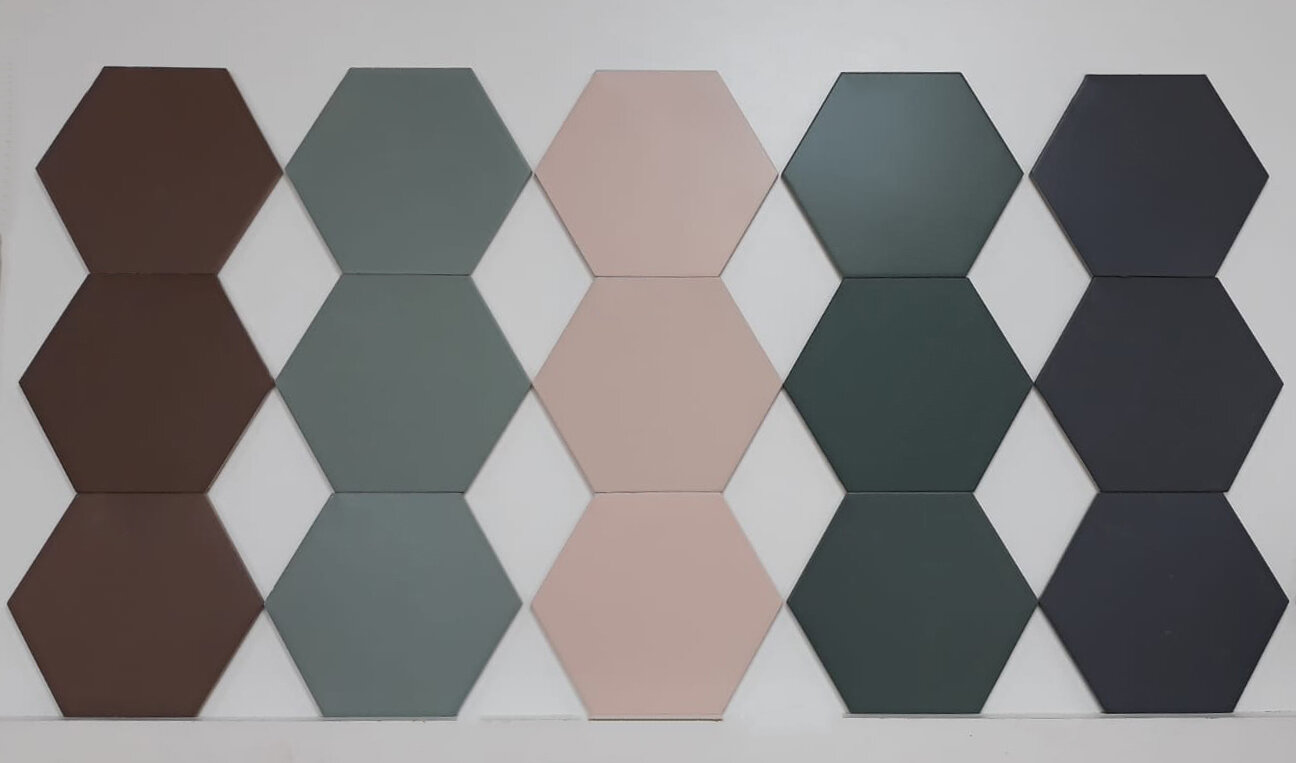
Colour Study of “Dècor Collection” / Test labs of the five solid colours (Ph. Courtesy of Ornamenta).
Ornamenta, DECOR Collection - Product design and Creative Direction
Décor Collection is a line of coverings in hexagonal format of Ø 23 cm in which the color returns to be the absolute protagonist of the spaces. Multiple combinations to break the rules. The range of colors of the moment characterizes the Décor collection: from the millennial pink to the forest green, the palette is formed by perfectly balanced colors. Décor is distinguished by its chromatic energy. Six solid colors embellished with a range of six textures declined in péndant allow you to choose the tone that best suits your style.
© Copyrights 2020 D-Segno Studio | P.iva 02651960359 | info@d-segno.com
